Color plays a far deeper role in home design than simply making a room look attractive. Embracing the principles of color psychology not only influences the mood and behavior of those within the space but also affects how size, warmth, and comfort are perceived. Many homeowners discover that working with a professional painting contractor can help translate an understanding of color psychology into beautifully cohesive interiors.
Each color evokes distinct emotional responses and sets the tone for different rooms. Making intentional choices based on color theory can help build environments that not just reflect personal style but also support well-being and daily activities. As you explore how colors affect our spaces, you can start to create rooms that are as functional as they are visually stunning.
The impact of color stretches beyond aesthetics. Subtle choices can bring a sense of harmony or cause unintended restlessness. Guidance on recognizing how natural light, texture, and placement work with color will help you make confident decisions for any home design project.
While following current trends can be inspiring, ensuring your spaces feel authentic and supportive means considering both practical needs and personal preferences. Ready to learn how to use color with intention? Dive into the following comprehensive breakdown on color psychology and its role in home interiors.
Understanding Color Psychology
Color psychology explores how different shades affect emotions and behavior, making it a powerful design tool. For example, blue often encourages calm and tranquility, making it ideal for bedrooms or relaxation spaces. On the other hand, red brings energy and passion, which may be better suited for dynamic areas where activity or socializing is encouraged. By learning these connections, you can select colors that echo the intended ambiance and function of each room.
These emotional cues can have a profound impact beyond mere decoration. They can help reduce stress, inspire creativity, and foster a sense of comfort. Understanding how to harness these reactions means your design will not only look beautiful but will also feel right for you and your guests. For a deeper understanding of how color influences our emotional state, this Livingetc article offers useful insights into color psychology.
Warm vs. Cool Colors
Colors generally fall under warm or cool tones, each impacting a space in unique ways:
- Warm Colors: Red, orange, and yellow create a sense of coziness and warmth. They can energize a room and foster an inviting atmosphere but may cause overstimulation in large quantities.
- Cool Colors: Shades like blue, green, and purple offer a calming, refreshing environment. These hues are perfect for unwinding after a long day or inspiring focus in home offices and study spaces.
The art of balancing these tones, choosing where to include warmth for comfort and where to feature cool hues for tranquility, helps create a home that supports a range of moods and tasks.
Room-by-Room Color Strategies
Strategically applying color in each room is the cornerstone of effective home design. Consider each space’s function as you plan your palette:
- Living Room: Harness warm neutrals such as beige, tan, or soft terracotta. These shades promote togetherness and make your entertaining spaces feel welcoming but not overwhelming.
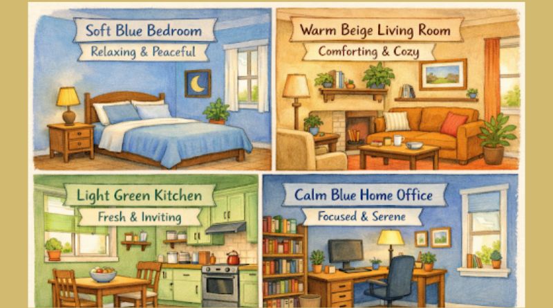
- Bedroom: Choose cool, restful colors like dusky blue, sage green, or lilac. These options promote relaxation and better sleep quality by soothing the senses.
- Kitchen: Vibrancy works well here. Yellows and soft greens can enhance energy and stimulate appetite. However, a pop of red as an accent also encourages liveliness.
- Home Office: Pale to mid-tone blues inspire productivity and calm. If you want to foster creativity, consider greens that evoke nature and new beginnings.
Common Color Mistakes and How to Avoid Them
It’s easy to misstep with color if you do not consider all the factors at play. Here are frequent pitfalls and how to sidestep them:
- Overuse of Intense Colors: Strong hues are best in moderation. Limit bold splashes to accent walls or decor, rather than saturating an entire room.
- Ignoring Natural Light: Sunlight transforms color. Always test paint samples at different times of day to ensure the shade matches your vision.
- Neglecting Personal Preference: Following design trends only works when the result aligns with your tastes. Your comfort and joy should guide each decision, above and beyond what’s popular.
Current Color Trends in Home Design
Trends in color reflect broader cultural moments and a desire to personalize interiors. In recent years, several color approaches have gained favor:
- Earthy Tones: The popularity of olive greens, soft browns, and muted ochres underscores a universal yearning for nature and tranquility within our homes.
- Soft Pastels: Light pinks, baby blues, and gentle lavenders are making a comeback, offering a fresh and understated way to experiment with color.
- Bold Accents: Accent walls in navy, emerald, or burnt orange make a striking statement. These deep hues, used thoughtfully, create drama without closing in a room.
For additional inspiration and trend analysis, explore this informative resource from Livingetc.
Staying in tune with evolving trends lets you refresh your space and express your individuality, even with small color swaps in decor or upholstery.
Conclusion
Applying color psychology in home design empowers you to create not just attractive but emotionally supportive spaces. By choosing hues that enhance each room’s intended use and prioritizing personal preference, the resulting environment will feel uniquely yours while fostering comfort, harmony, and inspiration.